The web lives life on the fast lane, and we often find ourselves working hard to keep up. What’s fresh and innovative one day feels dated the next. The pace makes it hard for brands to know when is it time to aim for a website redesign. If you’re asking that question, the likely answer is now.
Many businesses recognize the feeling of dread when that question creeps up on them. It can stir up organizational questions of inadequacy, stagnancy or the logistical weight of a new project. The bad news is that by putting off your redesign, you may be harming your brand’s potential success. The good news is a website redesign doesn’t have to be all that difficult. But how do you know you’re due for a redesign?
Why Redesign Your Website?
First and foremost, the aim is to elevate your brand success through traffic (visitors) and conversions (action). Whether that means signing up volunteers for your events, selling products on your online store, or growing an audience for your services, the aim of your website is to be an online sales asset. Before you can do that, there are 5 reasons you may need a redesign.
1. Your website is outdated.
Is your website responsive (usable on mobile devices)?
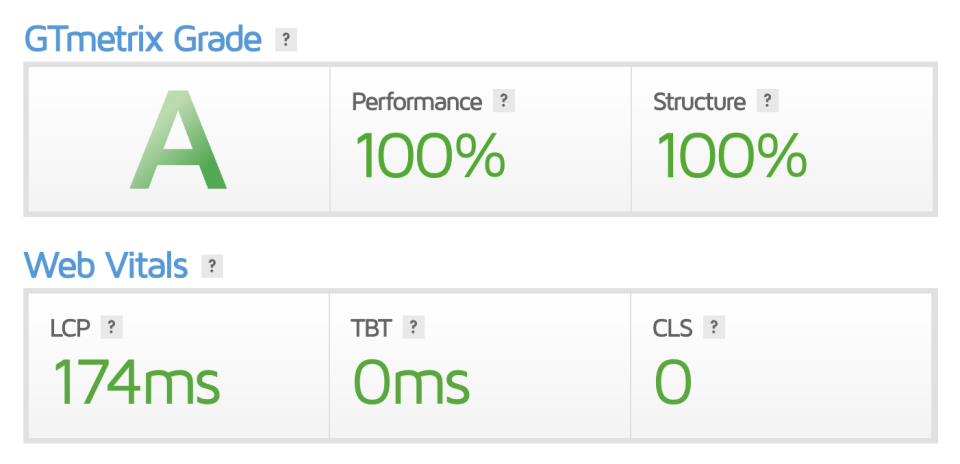
That may have been an useful standard to aim for five years ago, but today, the value of speed and performance keeps skyrocketing. How well does it perform? Today, websites are expected to be mobile-friendly, but a surefire way to stand above the competition is to also have a blazing-fast website.

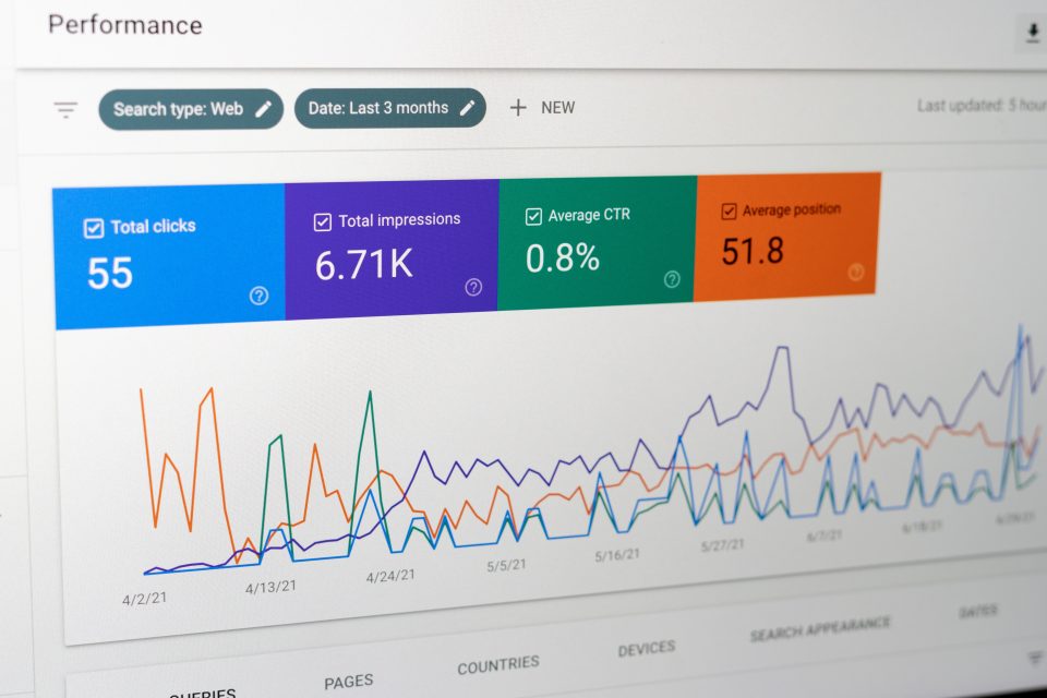
2. Your traffic, conversions and search engine ranking are slowing down.
Search engines like Google continuously revise how their ranking algorithm ranks your website. Speed has become a more important factor in recent years. Now that performance and speed are increasingly intertwined with search engine success, it is crucial to have a website that performs well so that it also ranks well. The highest conversion rates happen on online stores that load in 0-2 seconds.
There are many factors for a non-performing website, like using bloated page builders or poor optimization. Consider ways in which you can iteratively improve your performance, but often, for a long-lasting foundation, you may have to reconsider your website’s technology stack from the ground-up. As there are many moving factors, it may be wise to pursue professional input on your digital roadmap.

3. You’re not adequately meeting your KPIs or brand goals.
Key performance indicators are often neglected when considering a website’s potential. Rather than a static digital brochure, your website has the potential to be a functional sales asset working 24/7 for you. Are you leveraging that potential?
User experience (UX) design, conversion rate optimization, and sales copywriting are critical elements to draw your visitors to action. Are your Call-To-Actions prominent? Is it instantly made clear what users are supposed to do on your website? Efficient UX can ensure your website achieves what it’s supposed to.
4. Your brand has grown, and your website hasn’t caught up yet.
A very common problem is that businesses also grow fast, but their websites do not adequately reflect these changes. Some examples may be new staff or services or an internal restructuring. If your technology stack is clunky, it may make updating difficult so your agency may not make updates in a timely manner. Your website is the shopfront of your business, so make sure its updates are on pace with your brand. A leaner production process ensures you’re able to make updates on the go.
Digital marketing also heavily depends on data and analytics, because you need to see what works in order to build off that. Putting off a redesign means putting off valuable information you could be getting today about how your audience finds or engages with you.
5. Your functionality and features are failing you.
For your website to be a solid sales asset, it has to work, and it has to do that well. Is your website’s infrastructure future-proofed? Are your emails firing off properly, or do you find recurring issues with that? Are your forms inconsistent with how well they work? Is your website’s security vulnerable? Does it pass accessibility WCAG standards?
There are many considerations to make for a website, from a holistic, accessible, and user-centric design approach to functional features. The list goes on and on, and the best way to put out fires is to implement a strong digital strategy early so that your brand isn’t caught on fire to begin with. It happens, sure, more often than not, these are preventable with quality work.

Why Did We Re-Launch Revolutions?
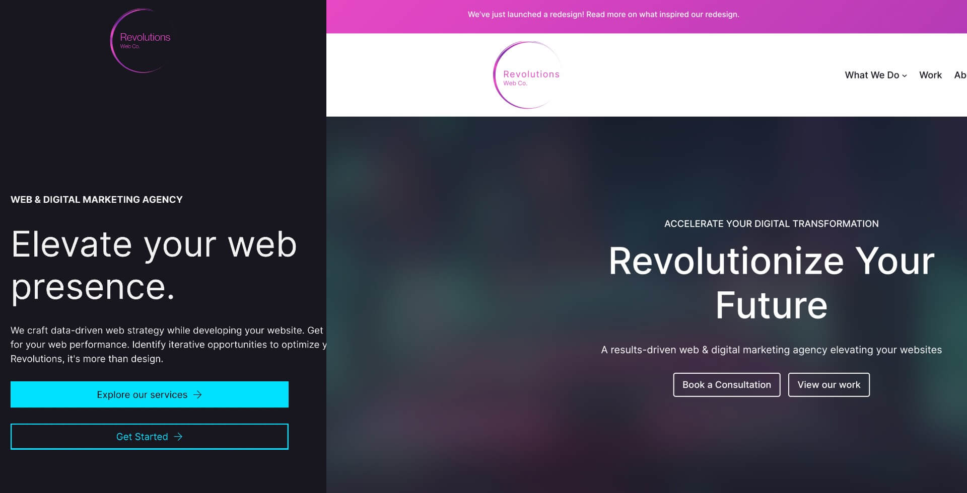
7 weeks after launching Revolutions Web Co., we have re-launched with a brand new architecture and design. This was already planned, albeit on a longer timeline. In the process of building Revolutions, I formed a three-part strategic plan for the agency’s technical stack(s).
Revolutions kicked off with a modern, dearly-trusted page builder (not Elementor 😉). I launched Revolutions Web Co. in June 2023, built on this stack. However, Part 2 of the strategic plan was to systematically migrate our infrastructure toward Wordpress’s native block themes. Within 2 months after launching, I felt it was past time to consider moving to Gutenberg earlier than later.
Some reasons included finalizing a production-ready process. There was no good reason to wait. Another reason for this move was to ensure our clients get the best potential as early as possible, instead of setting them up for a future migration. So, Revolutions re-launched with a new architecture. I also added a blog to share insights from my background of Wordpress development for a decade.

Step 3 of the strategic plan involves a major leap: headless development. Headless development is the decoupling of your content and your presentation, so your business can access and update content on Wordpress, but the website is coded in an app-like powerful javascript framework. This will take a longer time, along with some growth and the perfection of a production-safe process.
The seeds for this direction were planted as early as 2015, when Wordpress’s creator, Matt Mullenweg, advised Wordpress developers to, “learn javascript, deeply.” We have now arrived at this moment: the merging of javascript’s power on web browsers and Wordpress’s robust, open-source community. This is a direction that many top brands and corporations have already begun adopting.
The 1-2-3 steps on the technical strategic plan is a glimpse into the overall roadmap of Wordpress websites and the future to come. This is precisely what I mean when I say that Revolutions Web Co. is a forward-thinking agency. The future of the web has made its direction clear, and we intend to get you there. Websites no longer have to merely be digital brochures, but robust and interactive assets. Together, I believe we can take your brand further.
